A metric used to quantify UX friction on a task-based interface.
I will discuss assumptions, normalization methods, and limitations of the formula and how I use it as more of a conceptual reminder rather than strict calculation to be made.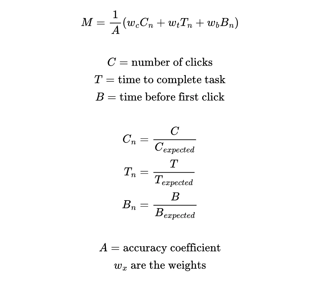
Inspiration
When I first began as a design engineer, I was once asked how I would attempt to model or quantify UX friction on an interface. I came up with a formula to attempt to capture this and shared it with my team, who immediately dubbed it the “Maria Coefficient.” The name has stuck and we still occasionally bring it up today, not as something to explicitly calculate, but just as a reminder of things to keep in mind when designing and testing new interfaces. I want to mention right away that I think the primary use of the coefficient is more as a conceptual reminder rather than a strict calculation. Interfaces are so varied that it’s not possible for one formula to appropriately capture and quantify user interactions everywhere. The concept of having a coefficient at all is the main takeaway — a reminder of the many factors that go into making a user-friendly interface and what we should seek to minimize and maximize when designing user flows.Old/Original Formula
This is what I came up with when asked to try to quantify UX on the spot. This was with no prior research and also in context of a task-based interface where a user would land on this page and need to complete a task or set of tasks ASAP. This was also meant to be judged in the general sense that “lower is better”; this version does not yet weigh specific components (as explained later, this leads to total time T dominating everything)
- UX cost grows linearly, each additional click adds equal friction
- Inaccuracy amplifies all friction
- Early hesitation = confusion (additional time before first click is bad)
- The units are inconsistent — some numbers are in seconds and others are in clicks. Things need to be normalized or else one thing will dominate. Without normalization, time T dominates (ex. 120 seconds vs 3 clicks). What we actually want to capture is: how much slower was this task than it should have been? There are a few ways this could be addressed: normalizing T using the expected completion time (T / T_expected) or using “excess time” instead of raw time (T — T_expected).
- Time before the first click isn’t always bad; depending on the task, the user might be thinking and planning. So this formula only works in a “task flow” page where there’s an end goal to accomplish ASAP, it’s not good for research/learning interfaces, where longer time on the page may indicate more thoughtfulness.
- Everything is weighted equally. We could later add weights for tuning, if we want one element to carry more weight than another for a specific type of interface.
Improvement 1: Component-Based Normalization
Based on the issues described, one way the formula could be improved is to normalize and weigh each of the elements separately based on expected values. This prevents one element from dominating and also allows for customization using the weights.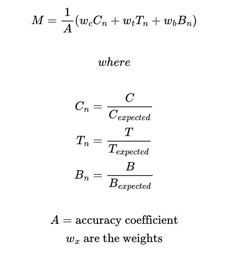
Improvement 2: Metric-Based Normalization
Another way to normalize would be at the metric level: divide the actual by the expected value of M. This answers the question “how far is this experience from our expected friction?”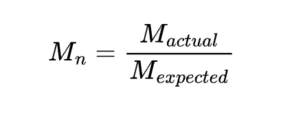
Which type of normalization?
Component-based normalization or metric-level normalization? → structural vs. outcome normalization.- Component-based
- Metric-based
Better as a tool for ux research
- Since we normalize each variable before combining them, all components are on the same unitless “scale” and can be easily compared. You easily can see which component most affects the final score, giving insight into where the friction came from
- We can control the influence of each variable with weights. The formula is customizable for different interfaces or priorities
- But what does this number actually mean? Lower is better, but “7.5” might not mean much to people. This is only useful if comparing variations of the same interface to each other.