My AI-assisted prototyping and iteration process for creating a new audio annotation canvas.
A new interface for annotating multi-speaker audios, made by leveraging AI tools to get a prototype ASAP and then iterating from there.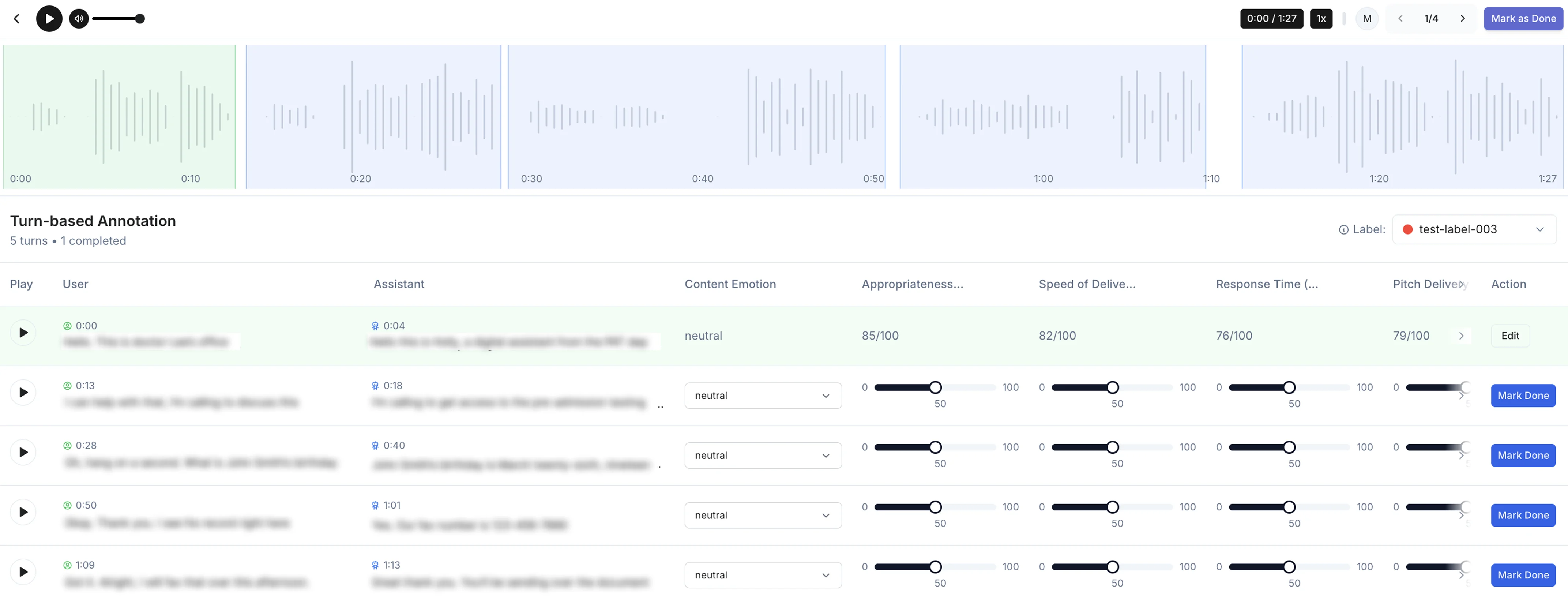
Problem
Previously, the Ocular platform had been set up for coordinate-based image and video annotation only, but we now needed a way to annotate multi-speaker audios.Requirements
According to our client’s requirements, the multi-speaker audio would be segmented into “turns.” Each turn is composed of one instance of each speaker talking (turn = speaker 1 + speaker 2), capturing one back and forth exchange. Annotation would be done “by turn,” so each turn should have standardized annotation data.Label Redesign
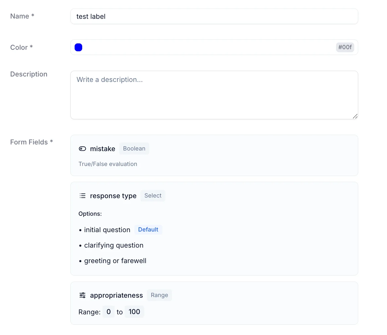
We decided that a “rubric” structure would be most effective for the annotations, allowing us to capture a variety of metrics for each turn, including tool call behavior and appropriateness and speed of the responses. The decision to use rubric-style annotation brought up the need for an interesting redesign of the label system on Ocular. Instead of single-word labels, which worked well for coordinate-based annotation, we now needed a flexible structure to capture multiple elements in the same label. In the interest of having minimal edits to our backend models and routes, the label would just store an additional “form” attribute where multiple customizable elements could be added, including range, multi-select, boolean, and text formats. This way, we could keep the same label setup on the platform and backend, except conditionally use the “form” attribute for audio annotation projects.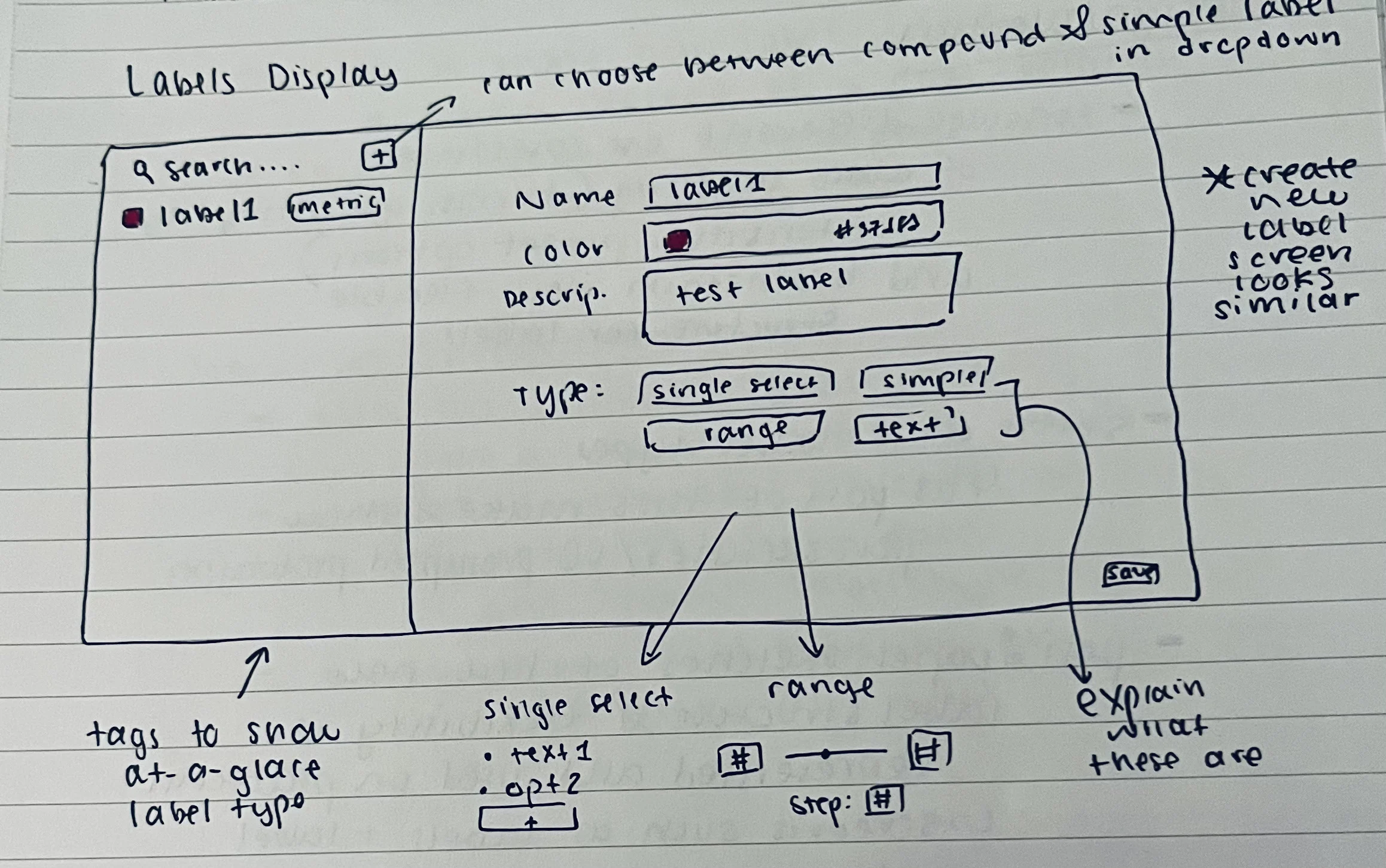
Annotation Interface Sketches
When making the sketches, I first added a full-width waveform visualization of the audio with highlighted sections for the turns. This would be crucial for allowing the user to quickly scan and understand the file’s structure and turn breakdown. On the technical side, I knew we had the appropriate transcript and timestamp data and could pre-segment the audio beforehand. For the annotation flow, I wanted to find the most optimal way to guide the users through filling out the form for each turn while requiring the least amount of clicks. I considered several options, including preserving the main flow from the image-based annotation (which required clicking on a section and then filling out a popup) or trying out a new different view. After some thought and discussion with teammates, we thought it best to try to show everything initially on one screen, allowing for minimal clicks and also quick visual assessment of the work to be done. The grid system, sketched below, has each turn as a row in the grid and the columns show the transcript and also elements of the rubric to fill out. When a row is complete, the user marks it as done with a button at the end of the row. The row and the associated turn section on the waveform then turn green to indicate completed status.
Prototype
This is where the design process starts to differ significantly from the “old” process detailed in Study 1. Instead of taking the sketches to Figma and making various iterations, I just briefly discussed the sketches with the team and then prompted an AI prototyping tool (in this case v0, but I have also used Magic Patterns and Figma Make)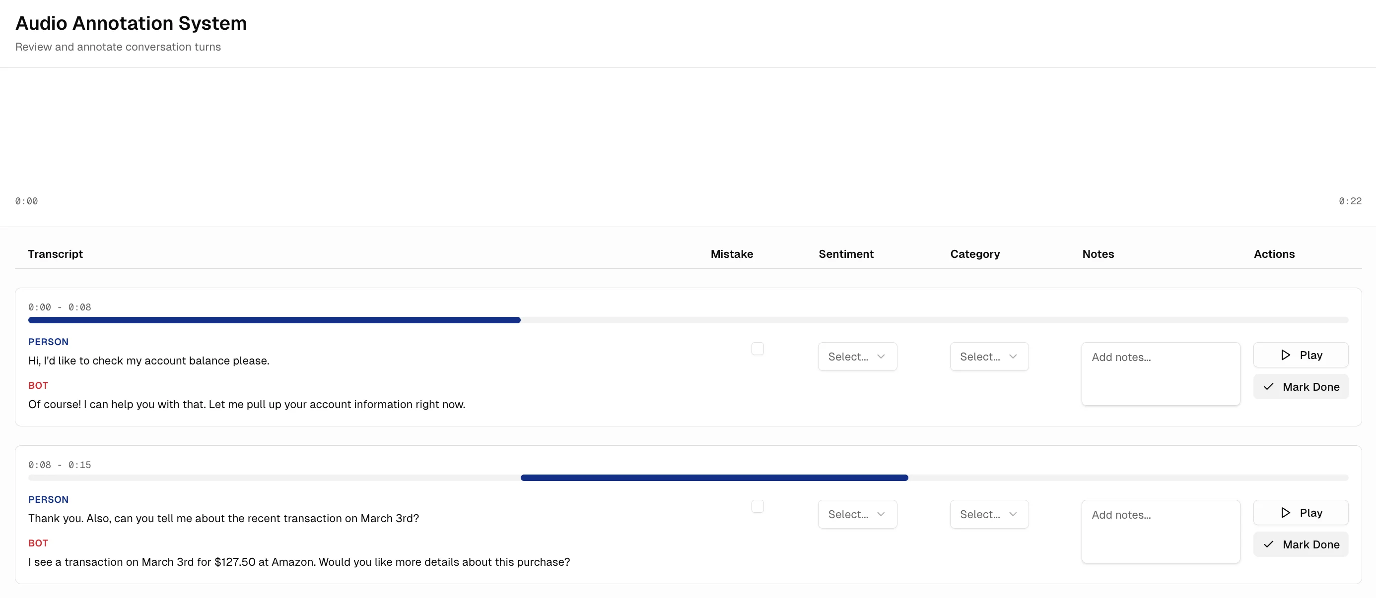
Development and Iteration
I then began building the “real” version of this interface in our codebase. As I was developing, I made various changes to the v0 prototype (mostly based on my own intuition at this point), including moving the transcripts to be side by side, moving the play button to the left, and adding hover states to visually link the rows to the sections on the waveform. Once the first version was ready, we then began the process of iteratively collecting feedback and making edits. We would deploy a version for people to test with, ask them how it went, and I would make changes in code right away and push the edits for them to test again. This process continues even today as we find more bugs and areas where the user experience can be streamlined.