In-depth user research, Figma design, and implementation process for revamping the image annotation canvas at Ocular.
Problem
The annotation flow on the platform’s canvas page was rudimentary and non-scaleable. The entire canvas was in need of a design audit and revamp. At the time, the platform had a canvas interface where users could manually create annotations on images using either a bounding box or segmentation tool, then select a label for that annotation. The annotation would only be saved once the label had been selected. The existing implementation consisted of a small menu that appeared directly at the site of the last mouse click of the annotation. As described below, this system had many issues, including the menu blocking other parts of the canvas, no signage, no edge case handling, and potential for lost work if the user accidentally closed the menu. I sought to improve the canvas annotation flow and in the process also revamp the entire canvas user experience.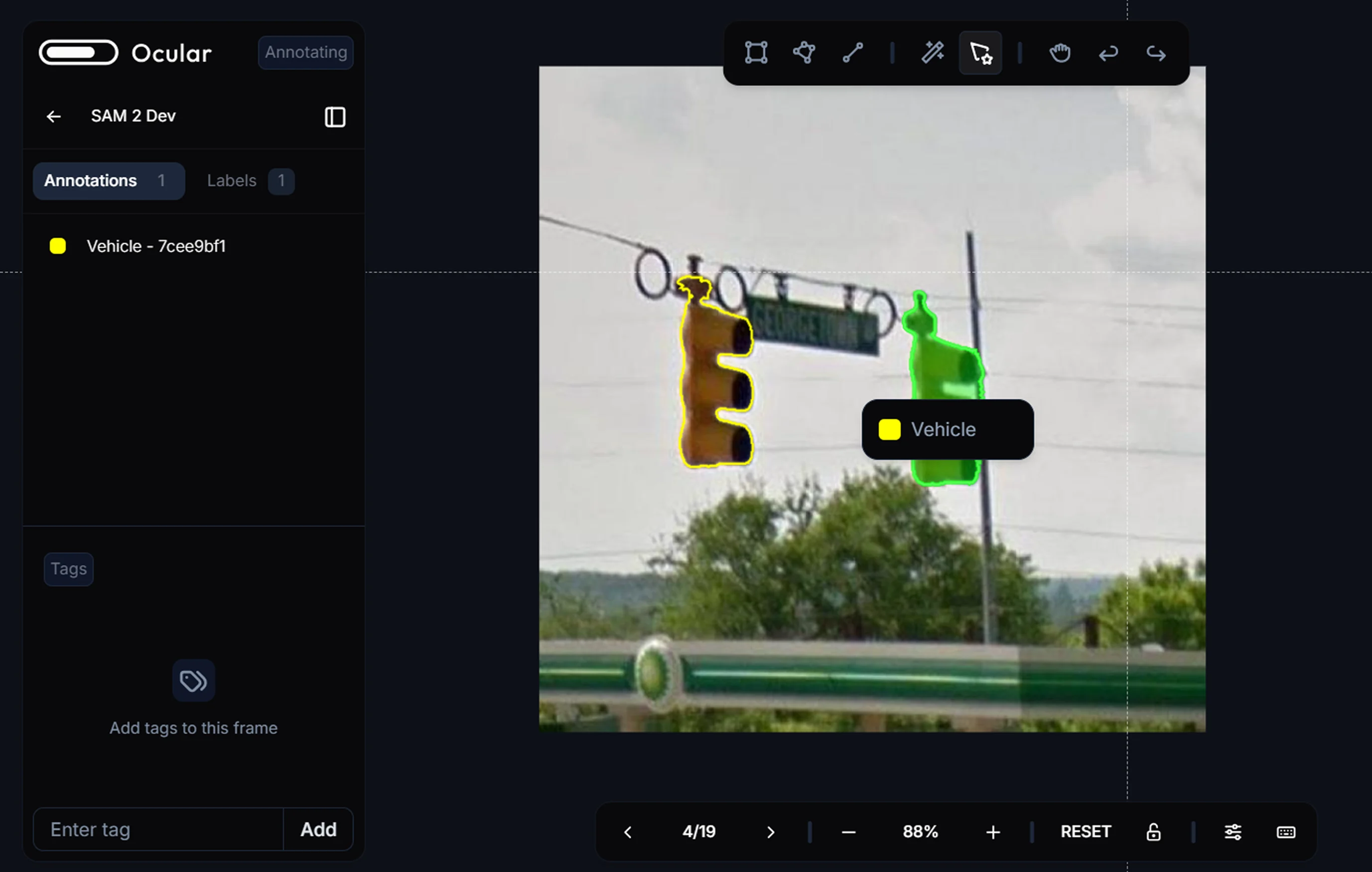
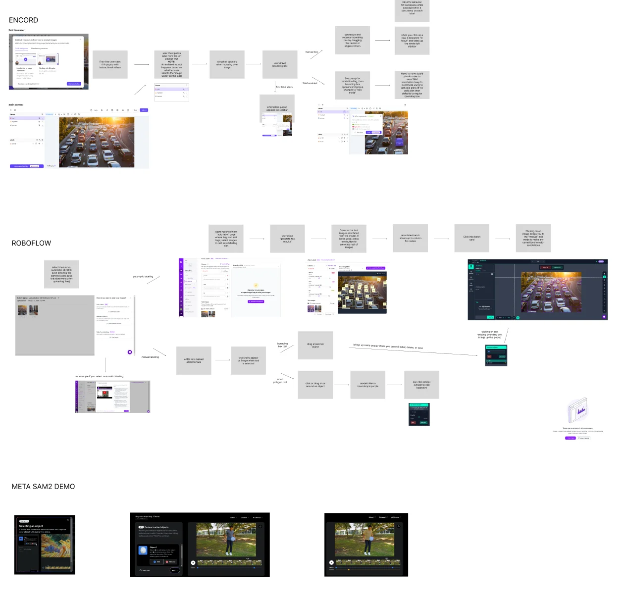
User Testing and Competitor Research
I first sought to understand the exact user flow and pain points in the current annotation system. Based on my own experiences and observations of my teammates using the canvas, I sketched out a flow of what selecting and labeling an object in an image currently looks like, making note of pain points, places where users were unsure what to do next, and potential areas for improvement.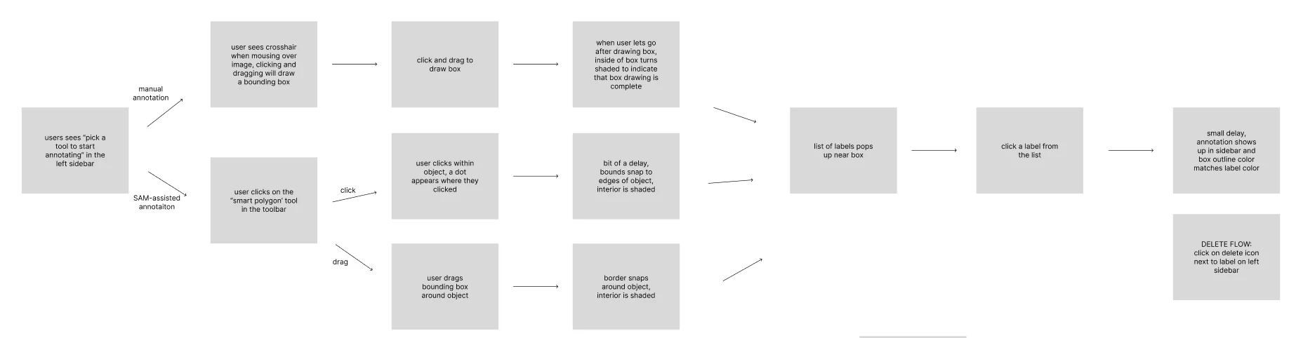
- Labels popup covering part of image and annotation
- Users not knowing which tool to select. There are many options but most commonly used were the bounding box and SAM2
- Accidentally clicking elsewhere closes the menu, annotation is lost
- No error handling or messaging for when no labels are yet created in the project
A note on user testing: at the time, this product had not launched and we did not have any “real” users, so most of the testing was done with other members of the team. I realize this isn’t ideal but I also think it’s common for many pre-launch small teams on a time crunch.
- For sidebar-based annotation, needing to click on sidebar repeatedly to make a new annotation — too many clicks for the user to complete many annotations efficiently
- With lots of annotations, boxes overlap and become hard to distinguish
- Separate flows for AI-assisted tagging and manual tagging
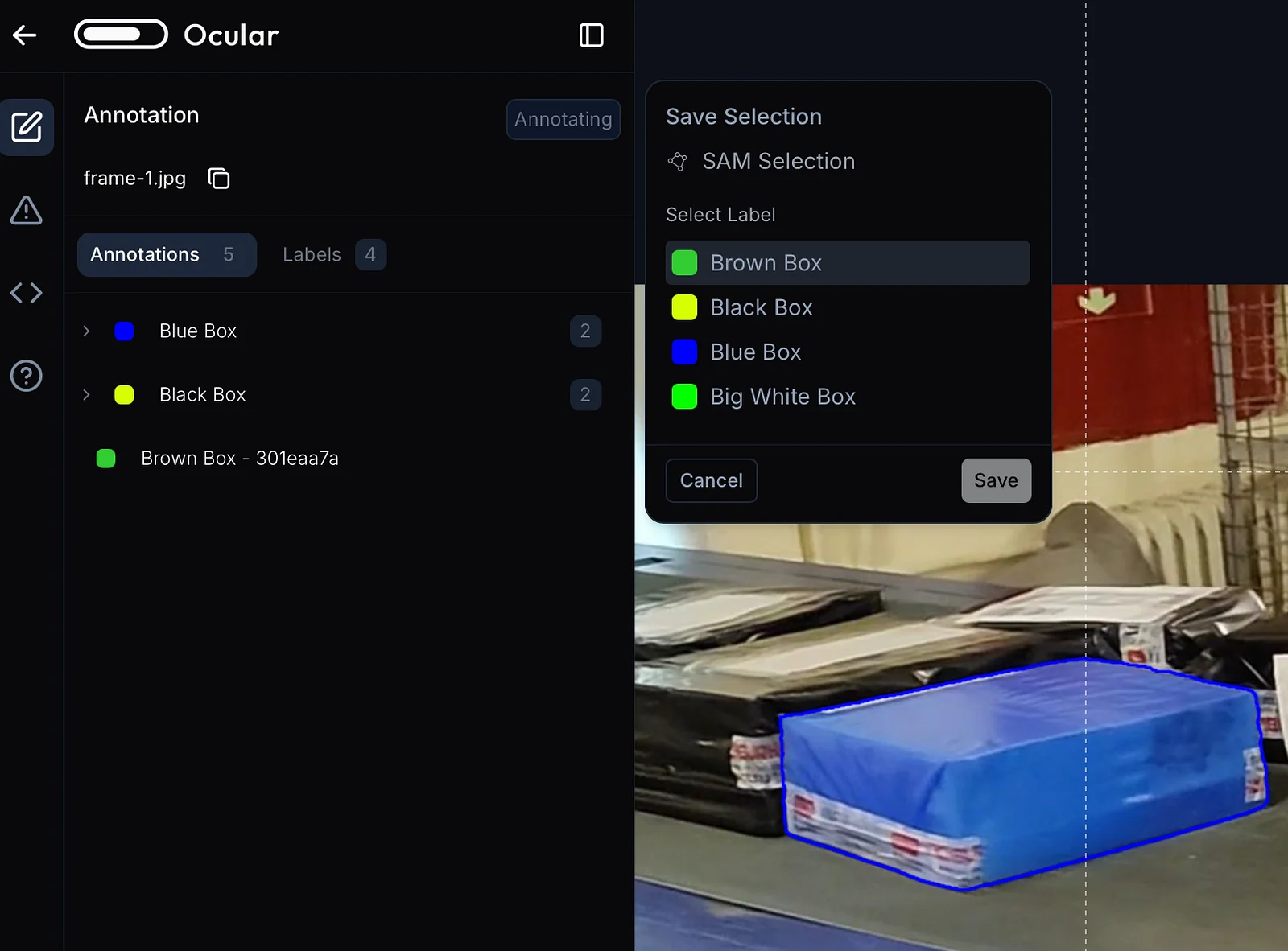
- Popup appearing next to left sidebar in consistent place, not covering main canvas space
- Ability to edit segmentation annotations (smoothness, adjust points)
- Secondary sidebar (similar to VSCode secondary sidebar) allows for more functionality to fit in the same area
- Tutorial videos for first-time users, icons or tabs to access documentation
Problem Statements
Data annotators need a simple and intuitive flow to label objects in an image in order to efficiently but accurately annotate large amounts of data. How might we provide users with an intuitive yet robust system for labeling objects, while maximizing visible canvas space?Ideation
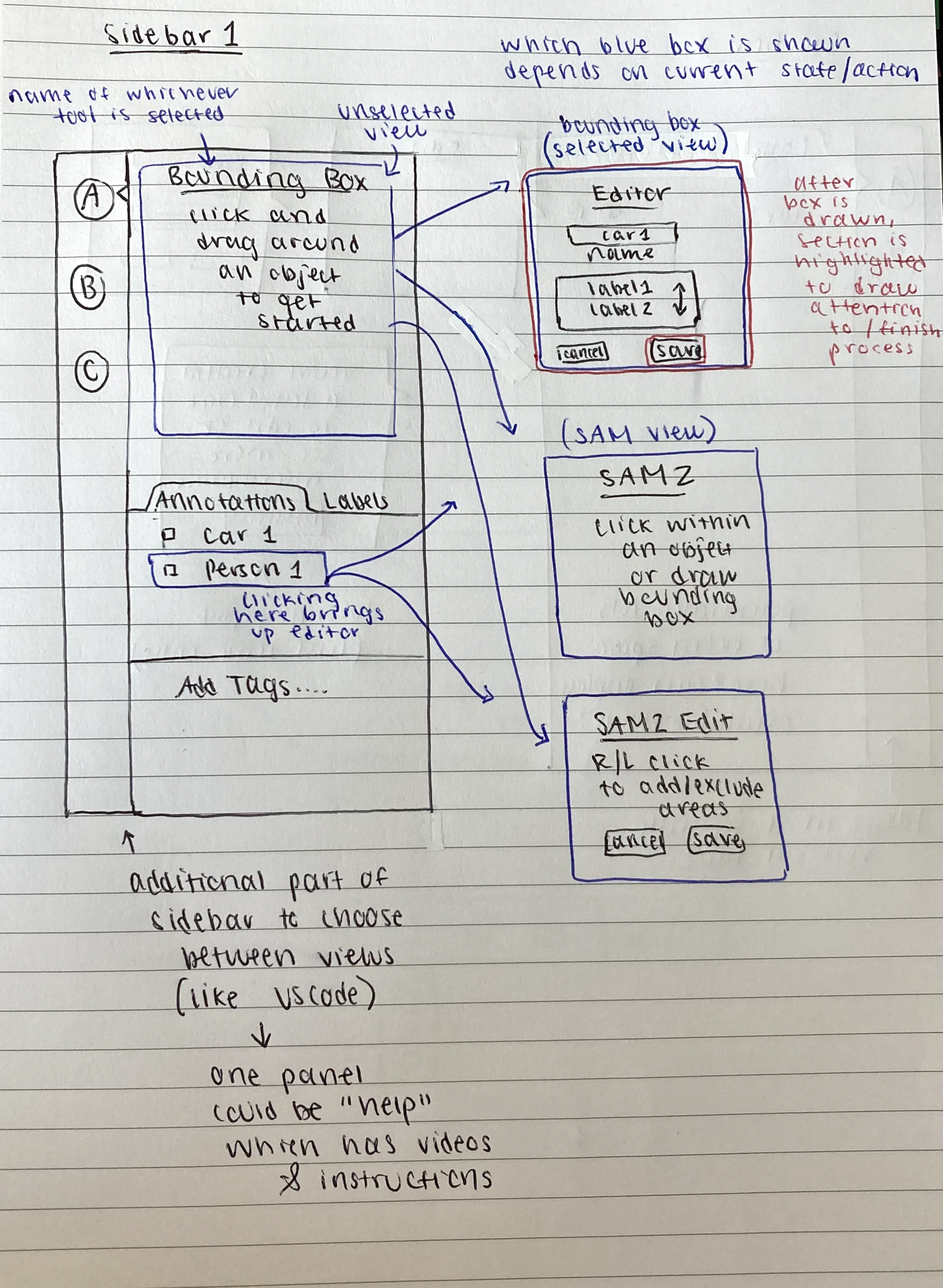
Some ideas and sketches I had:- Using the sidebar space to show information about the currently selected tool
- Labeling popups near sidebar rather than near/over the annotation
- Edit modal that appears when a label is clicked on sidebar
- Using left & right clicks to add/remove pixels from the SAM polygon
- Secondary sidebar. Previously we had both a left and right sidebar, but by using tabs on the left sidebar, we could combine the sidebars and free up more space on the canvas
Prototyping: Wireframes
Simple mockups of the sidebar space. Although only a few are shown here, I made 8+ iterations with different layouts/functionality to share with the team for feedback. Main points to show are:- Secondary sidebar
- Different options for annotation label selection (in sidebar or popup in a consistent place outside sidebar)
- Easy way to cancel or submit, no risk of “losing” draft annotation
- Clear documentation about available labels and currently selected tool
Discussion
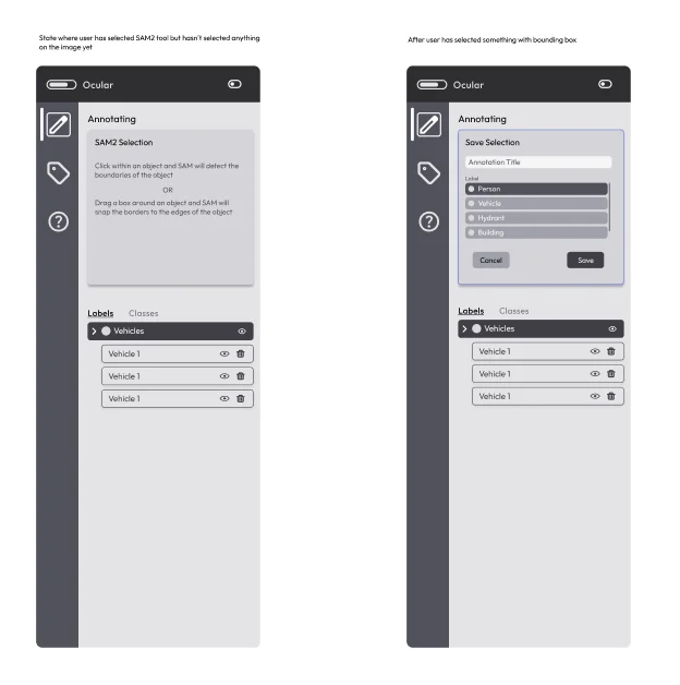
In addition to general feedback about the sidebar layout and canvas edits (moving around some of the toolbars), I narrowed the annotation flow down to two main options and asked the team for input. One option was having the labeling choice happen within the sidebar and the other was to show a popup right outside the sidebar. I ended up choosing the second option, the popup outside the sidebar. The reasoning for this was teammate feedback explaining how the label selection within the sidebar itself wasn’t noticeable enough. It wasn’t clear to them that there was some kind of action they needed to take in the sidebar in order to confirm. But their attention was immediately drawn to the separate popup when it appeared; it was clear an action was needed in order to “finish” the annotation and dismiss the popup. I also received very positive feedback about the secondary sidebar with regards to scalability. As we planned to incorporate more functionality into the canvas in the future, the tab system would allow us to opt between many different tools and displays in the future without making the sidebar space feel crowded. The tab system on the left sidebar would also allow us to remove the right sidebar, freeing up more space on the canvas.Prototyping: HiFi Prototypes
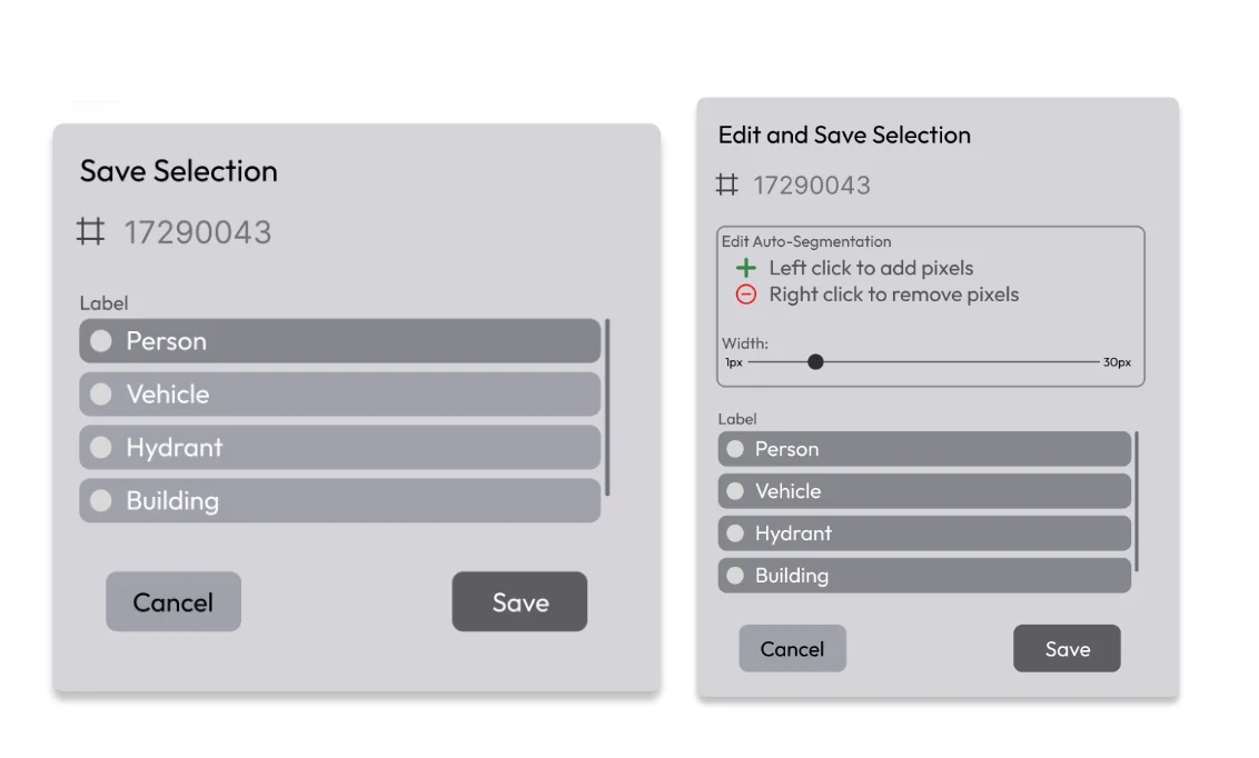
Used actual design system — real colors, attention to detail. Last step to gather feedback and confirm smaller UI changes before starting development.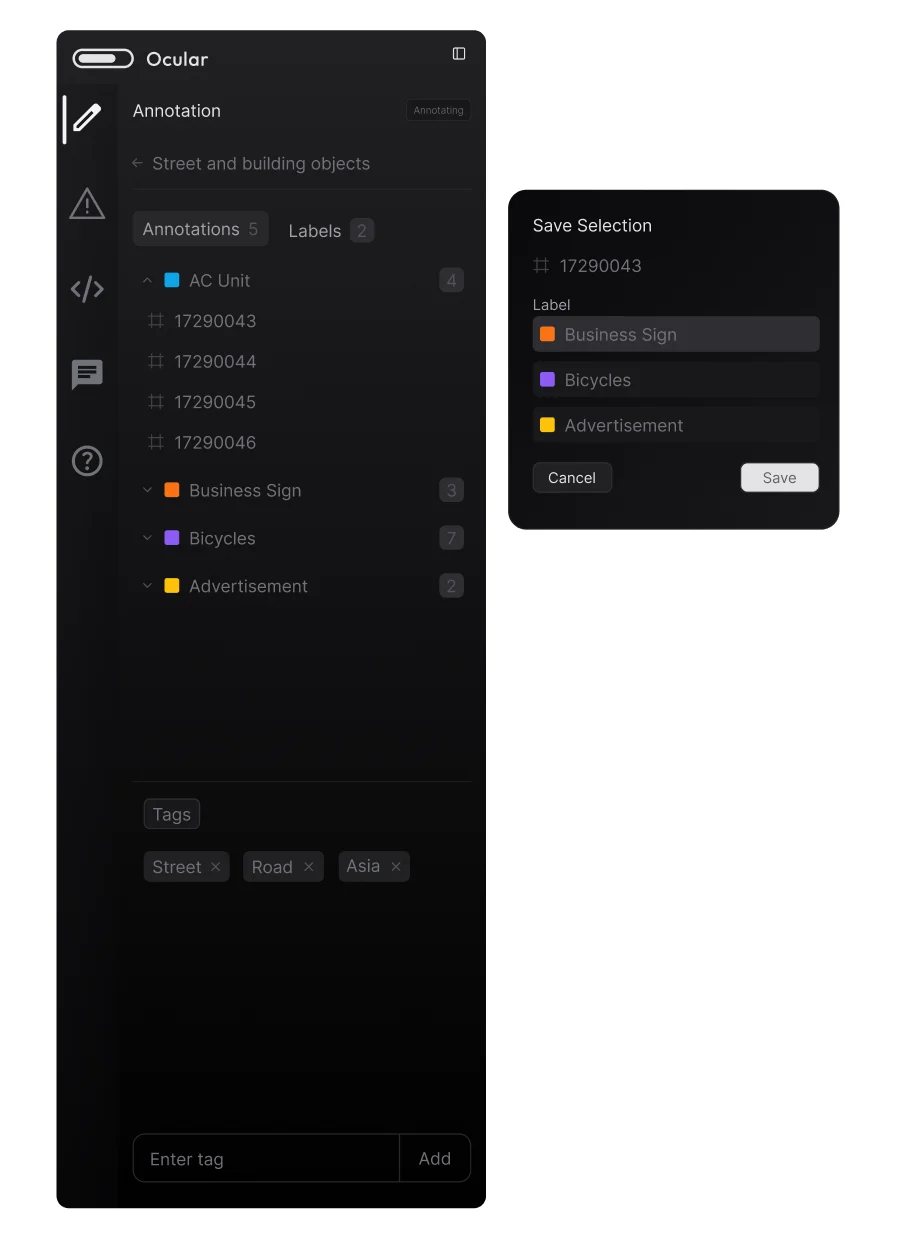
Implementation
These were roughly the steps I took in code to make the necessary changes:Reposition the label dropdown
Find where the current label dropdown is being rendered on the canvas and change the position to the top left corner near the sidebar. As part of this, I found I needed to separate the popup into its own component.
Conditionally render options
Render different options on the popup based on which tool was used to make the current selection.
Add secondary sidebar
Add wrapper to show secondary sidebar icons and then conditionally render different sidebar “pages”. Move content from the old right sidebar into tabs on the left sidebar.
Make the sidebar resizable
Allow users to drag the sidebar to their preferred width, setting responsive min and max limits.